how to make a signup flow

I think the first exchange of a relationship is the most important - first impressions, first dates, and greetings. A warm introduction can initiate a lifelong friendship, a playful tease can spark a romantic connection, and a firm handshake can lay the groundwork for a strong business relationship. Each individual can meet tens of thousands (80,000?) of other individuals in their lifetime, but we end up with a circle of 5-10 important people in our lives. Some of that is circumstance, but a lot of it is conscious (or subconscious) filtering down to that 0.01%. So, the first hour or 5 minutes can change everything in a relationship - the nature of it, and whether it will form at all.
Bare with me while I romanticize technology in the same way. The signup flow is the first exchange your user has with your product or service. Before they’ve reached your signup flow, they’ve gone through an arduous journey. Their inboxes are flooded by a myriad of other products and services, their credit cards are feeding uncanceled subscriptions, and their problems remain unsolved. On top of that, they’re humans, meaning they’re dealing with laundry, kids, and any other daily life struggles. If you’re selling B2B, your users are similarly overwhelmed by vendors, packed work schedules, and business targets to hit. You’ve got their attention for 5 minutes. How will you use those 5 minutes in order to build a relationship with your user?
I’ve helped build signup and onboarding flows at Figma, Alza, and now at Tandem. It’s a simple art that can change everything in the business - whether helping us reach our 2,500 bank accounts at Alza or next 1,000 healthcare practices at Tandem. Most importantly, it’s the start of the relationship with your users. While onboarding a user for the first time, you’re forming their understanding of your product / service and how they can use it to solve their pain-point. Here’s some themes I think about with signup and onboarding flows:
Storytelling
We see the world in stories. Every Nike ad puts you at the center, just doing it. At their core, every user wants to feel like Oedipus finding his Tiresias, his prophet, who will help them on their journey. Today, the apps that have the best storytelling typically are the consumer social apps, because they have the hardest job grabbing users’ attention. A platform like 222 has the daunting task of convincing users to use an app they may have never heard about to meet with a group of strangers, in-person. If you download their app, you’ll be taken through a beautiful haptic experience while it explains to you that by joining 222, you’re finally choosing chance. Their signup flow evokes a feeling of community and “finding your people".

Whether it’s through an immersive onboarding experience or just well-written copy, a good signup flow makes the user feel something. One of the prerequisites for telling a good story is understanding your audience - what will resonate with them? What do they care about? At Alza, we had to make a tough decision in between serving recent immigrants or serving bicultural Americans. Each one deserved their own pitch - the former, looking for something solid and trustworthy. The latter, looking for something warm that reminds them of family. Once we settled on our target customer, it became much easier to craft the ideal experience for them, something that would make them say - ah yes, this is for me.
Respect
When your only view of your users is a conversion funnel, it’s easy to lose empathy and respect for the human behind the screen. I have the bad habit of blaming “user error” (or more modernly, “skill issue”), when users don’t use the interface exactly how I expect them to. My coworkers at Tandem, though, have served as good stewards of the user, pushing me to think about expectation-setting, transparency, and preserving user freedom. Some examples are:
Letting users know what they’ll need ahead of time (e.g. Do they need to prepare a set of documents?)
No mysteriously disabled buttons (either adding a tooltip or showing required fields on click)
Indications of progress and remaining work (progress bars, checklists, etc.)
Showing longer forms upfront, instead of “baiting” the user with short form inputs spread out across many pages
Detailed error messages that guide the user on how to troubleshoot
Alerting the user that a process may take X business hours / days
Informing the user about the next step at any given point
Respecting the user’s time by minimizing unnecessary screens / clicks
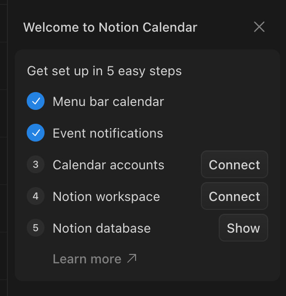
A simple example is Notion Calendar’s onboarding modal, which equips users in a quick and non-intrusive way. As a user, I’m not forced to do any of these, and I can mark them done (in which case the CTAs will disappear) or mark them un-done. The steps are simplified to 2-3 word titles, with explanatory modals and a link to learn more. When I’m done, I can quickly dismiss onboarding and find these setup items elsewhere in the product.
Trust
User trust is precious. It requires time to build and can be broken in seconds. In fields like healthcare and fintech, users’ top concern will be the safety of their data. A lot can be accomplished with just a well designed UX, though.
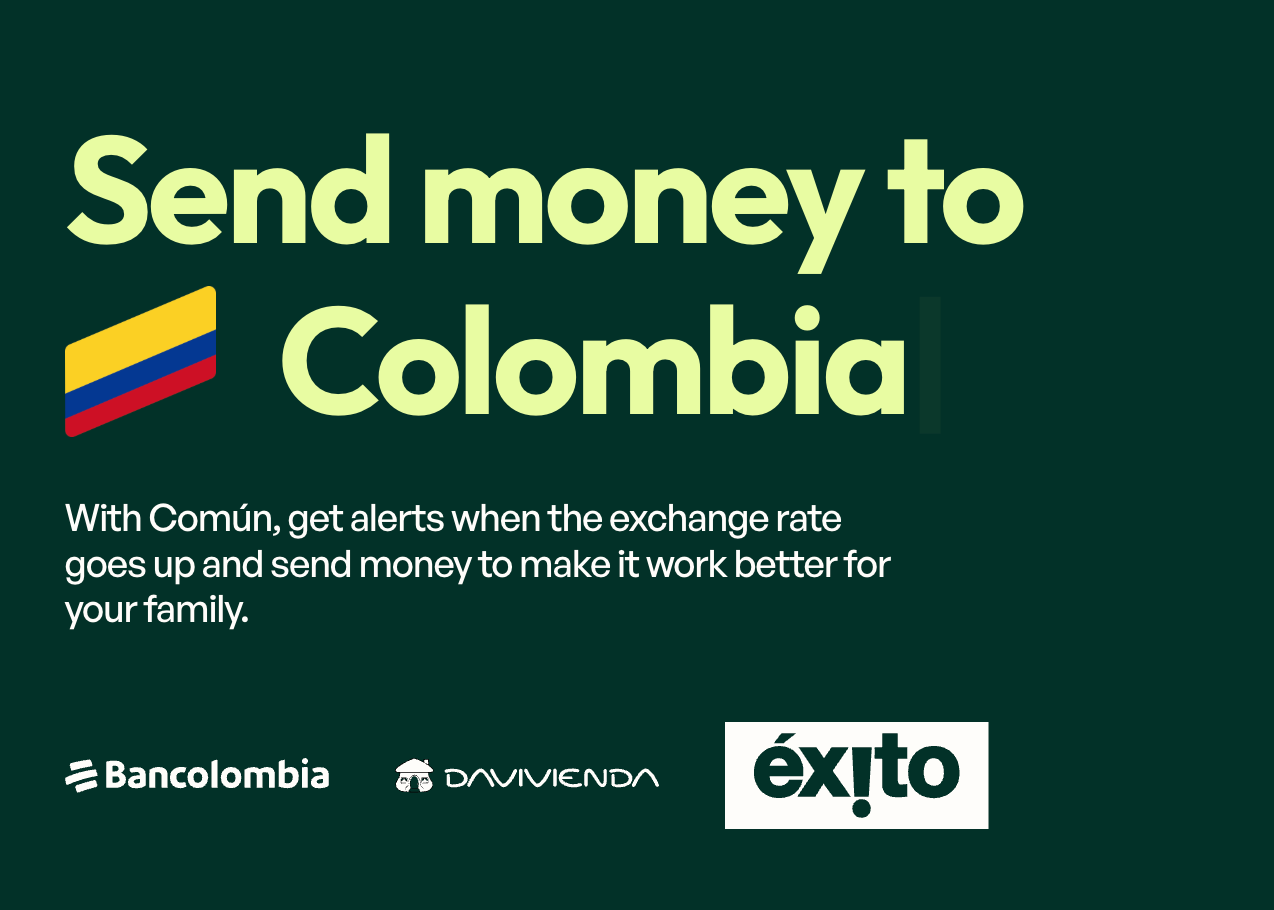
At Alza, we had to convince users to do things like give us their SSN and send money abroad. The latter was especially hard because users had been scarred by predatory or dysfunctional remittance services. A similar startup, Común, uses logos on their landing page with a carousel of countries to show users upfront that their bank is supported, before they even begin the signup process.
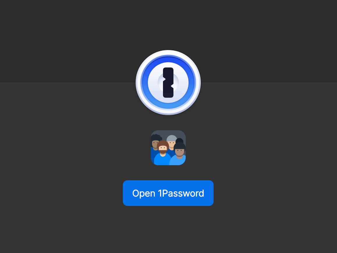
When it comes to making users feel comfortable enough to input sensitive information, I look to password apps for inspiration. An Alza coworker had initially suggested we make our SSN page physically feel like a lockbox, similar to OnePassword’s UI.
Logos and UX polish can go a long way. It’s similar to designing a resume or dating profile. Specific references, recognizable brands, human faces, etc. all help users feel like they’re in good hands. It doesn’t need to be something formal - it can be a quick demo loom video emailed out with your face in it, that lets users know there’s a competent human behind the curtain.
Security
A signup flow is also your most vulnerable attack vector. You need to assume that people will try to break through, inspect every network request, bombard any route, traverse storage file paths, and construct their own GET requests. It’s prime territory for not only bad actors but also overly curious competitors. Some gotchas:
If you’re exposing a treatment conditional on a user state or DB constraint (e.g. existing user) it should be gated behind verification. If a user inputs a phone number or email, verify ownership before revealing that the phone number or email already has an account. Otherwise, you’re leaking your user base.
You’ll likely be fetching files from storage (e.g. S3) and executing other requests with user input. Sanitize and validate all user inputs.
More obvious for engineers, but it’s critical to add rate limits (distributed with a system like Redis) and authenticate or limit GET requests as much as possible. Be careful with what you log to the console and what it reveals about your system.
It’s okay to make the user verify their identity first before unlocking the full functionality of your product / service, even if this is an asynchronous process.
The art is in enforcing security while making signup and onboarding still feel seamless and frictionless for the user. This means letting security checks and validations run in the background, or clearly communicating when there’s bumps in the flow (e.g. “heads up, verification can take up to 1-2 days”).
Final thoughts on signup and onboarding
Designing signup and onboarding flows is an intellectual and creative challenge. There’s strong constraints (time, attention, exposure, etc.) and lots to gain. Going back to my initial thesis, a great signup flow can mark the start of your relationship with a power user who tells everyone they know about your product / service. Maybe you sneak in some joyful elements like Apple’s verification code shortcut:

Which more broadly is an example of what really matters: Anticipating user needs. Once you know your user well, you’ll know what story to tell them, how to guide them, and how to help them make the most of your product / service. From the copy, to the assets, to the CSS and API interactions.